Helping web teams
work more efficiently
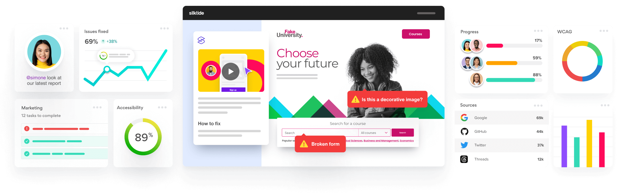
Monitor everything in a single, easy-to-understand platform, and save hundreds of hours of tedious, manual work.
Inspiring your
organization
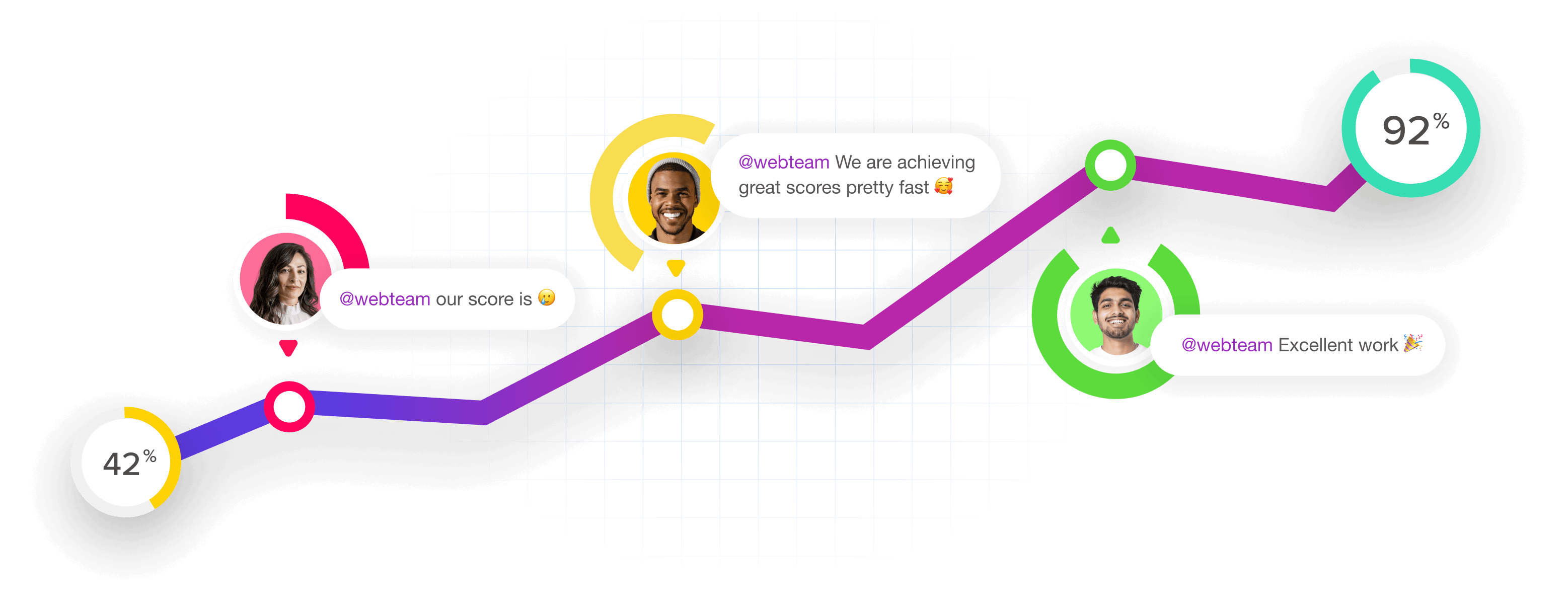
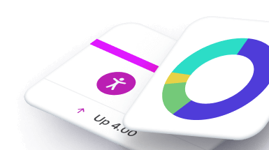
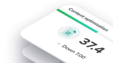
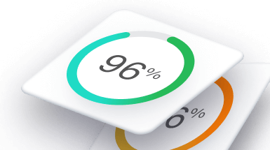
By monitoring your progress over time, Silktide ‘gamifies’ the process and inspires your whole organization by encouraging excellent work.

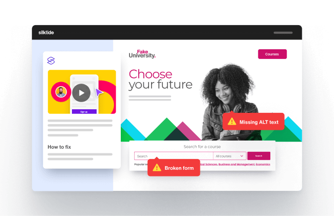
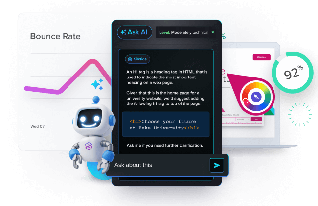
Making improvement easy
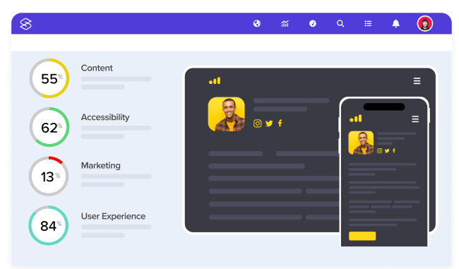
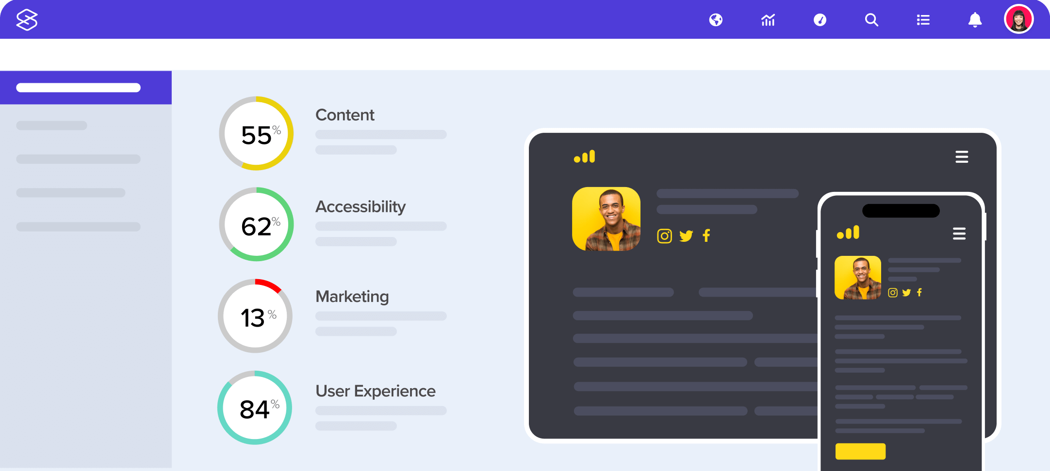
Find and fix website problems super easily. With comprehensive, easy-to-understand explanations, your team will get more done in less time.

- Helpful videos
- Easy explanations
- Complete tasks quickly
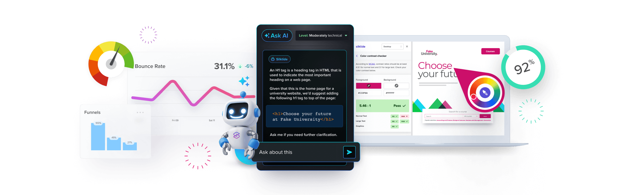
Experience the platform
There’s so much on offer inside Silktide. The best way to understand what you can achieve is to see it for yourself.
Every website management tool
in one unified platform
With a full suite of tightly-integrated tools, you can achieve more together.
-
Accessibility
Meet your legal obligations against WCAG 2.2 and ADA.
-
Content
Protect your brand by checking spelling, grammar & broken links.
-
SEO
Grow your reach and marketing with a highly-optimized website.
-
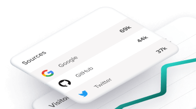
Analytics
Track your users anonymously with cookie-free analytics.
-
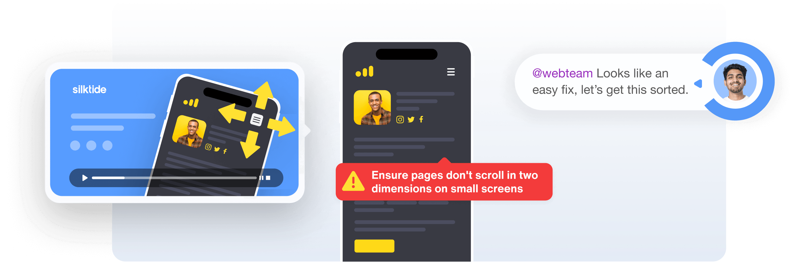
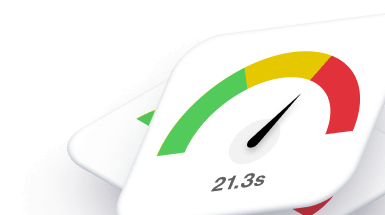
User Experience
Be blazing fast with speed, functionality, and mobile testing.
-
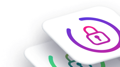
Data privacy
Monitor GDPR compliance across your websites.
Consistently voted #1 for usability by G2
Our customers love how easy Silktide is to navigate, helping them get more done in less time.

“Silktide has exceeded expectations. They’ve provided better support, an easier-to-use platform, and a better price.”
- #1 Accessibility Platform
- #1 Digital Governance
- #1 Digital Analytics